Monday, April 30, 2012

wips

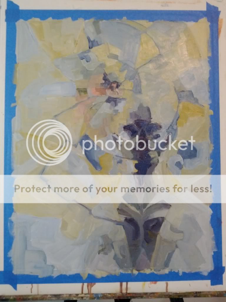
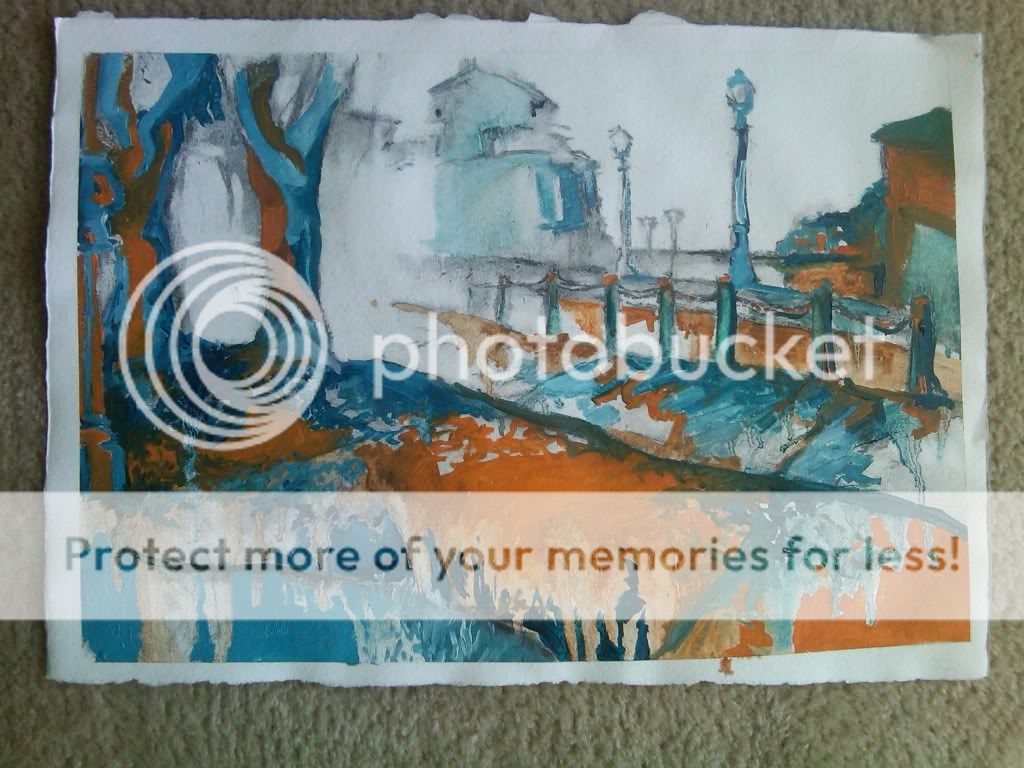
Felt super guilty for not putting anything up for the last couple of days. Sooo....here are some screenshots of what I am working on?


That first one is super zoomed in, but the rest of it looks pretty terrible so far, and will likely to continue to look not super great for a couple of days. True story: I thought I had taken a screencap of my GW2 character, but I didn't actually do that, so I am just going from memory. It was either that or wait for the next weekend beta event, which should be in about a month, and that is...no. I am impatient. 

Bottom one continues to be sleepy cross eyed tony because avengers finally at last. yes. 

Thursday, April 26, 2012

still bad at titles

Finished this one not long after I posted the last one, but I didn't want to upload two too quickly.


Oh and also here is this doodle of Tony Stark because I am excited for the avengers and also wanted to paint a face (will get around to the actual rendering later):


...just realized exactly how large I drew his eyes. Hahaha, what? 


Wednesday, April 25, 2012

Diffuse


Been working on this for the past three days. pfwah. 

Now I just need to fiddle endlessly with the settings to get it to print properly, and I win! Also a title, I suppose (the one at the top of the post is temporary.)

I've been thinking about resurrecting my dA page, too; I have a very limited social life, post-graduation, and talking shop is one of my truest joys. 


Monday, April 23, 2012

Strawberry Blonde + a brief overview of SPACE

Did this today while taking a break from a different digital painting that I was working on. 


The other piece is based on a sketch I did while I was at SPACE this last weekend, which segues nicely, don't you think?

This was my third year attending SPACE and was, by far, the slowest. I don't know if there really were not as many people attending as in previous years, or if was just that I ended up in an unlucky aisle. But despite that, I was able to comfortably make up the cost of both the table and the hotel, so I can safely say that I will be attending next year (and for the forseeable future. Even if I hadn't made the money back I'd still go: it's an enjoyable experience every time)

That being said, I was definitely not in the right headspace for dealing with massive amounts of people. Or even small amounts of people. I could have handled things more gracefully, and have done in the past. And will do in the future. Learning Has Occurred. 

There is, however, one thing about this year's SPACE that has been weighing on my mind pretty much since the start of the con on Saturday morning. I want to make it abundantly clear from the outset that this is not a thing that I am assigning blame for, nor even a situation in which blame comes into play. It doesn't. It's just a thing that happened. 

I've been thinking a lot about who the audience for my works is, recently. With paintings, I can't always get a clear picture, but when it comes to comics I know that I'm aiming for the comics as literature crowd, people who are looking for stories, first and foremost, who understand my need to explore the medium and push at the squishy bits. They're equally likely to be male as female and are late teens to middle adult. I was tabling with Diana Busby this year, whose audience is primarily children who are like the child that she was: intelligent, imaginative, and perhaps just a little bit deranged. Neither of us really go in for the things that people outside the industry think of comics as being: superheroes and hypersexuality. 

So, of course, we ended up placed next to someone whose whole reason to be seemed to be tied up in those two things. (Our other flank was protected by Leslie Anderson and Jared Anderson, so there was that.)  First of all: more power to him. That guy had a fuck ton (ha ha) of books, all hand produced. Plus, talk about knowing your audience. It was pretty lowest common denominator, male-gaze only type stuff, but if that's what you're in the market for, you're gonna find something there. The problem was that the people who would be drawn to the sort of thing that Diana and I were doing would most often not be interested in what he had to offer (and vice versa, of course.) 'Not interested' is a nice way to say 'found offputting and repulsive.' I watched a lot of potential customers see our table, start to come over, maybe even start to reach out to page through something, only to have their eyes hop briefly to the next table over. 

And then they would walk away and not come back. This was VERY FRUSTRATING. Frustrating enough to DESERVE LOTS OF CAPITAL LETTERS. 

But that is the way things go sometimes.

Also: I've definitely got to start selling prints at these things. And I'm going to put together a book of paintings as well (boy howdy am I looking forward to editing all those images. yeesh)

Thursday, April 19, 2012

Korra

So you know how I keep trying to be serious time professional person?

Nope! Fanart time!


Legend of Korra is seriously awesome. I feel safe in saying that even though there have only been two episodes aired so far. 


Wednesday, April 18, 2012

Misprints

Pages, when printed, are meant to look like this:


But SOMEONE decided to be a rebel this morning.


I actually have no idea why this happened. This page was at the beginning/middle of a stack of pages that otherwise printed perfectly. And it looks pretty good this way, which is reassuring because I was thinking about using a color scheme like that one for the next book in the series. 

EDIT: butts butts butts, the imaging drum on the printer ran out of....whatever. Images? I actually do not know how laser printers work. Gonna have to find a kinkos or something to print out the rest of the book (BUTTS)

SPACE prep

Preppin' for SPACE. y'all gonna be there? 'cause you should go.

Anyway, I'm about halfway through printing Hunt aaaaaaaaaand I need to sleep. The printer is super slow and I've got my computer back in fighting form, so here is a super sweet doodle of me in all my hufflin' pufflin' finery.


Awwwwww, yeeeeeeeaaaaaaaaaaaaaaaaaaah. All photoshop, all the time.


Saturday, April 14, 2012

'We all wear masks' and 'self 04 (fade)'

A couple paintings today! 

Uploaded from the Photobucket Android App

I picked up the first, what? six or so issues of the latest Ultimate Spider-Man. I like Miles Morales a lot and am definitely looking forward to Spider-Men. I spent a lot of time while painting this thinking about Spider-Woman's portrayal in these issues, how no one seems to know who she is and how she's (rightfully) frustrated by that. I don't know how intentional that was, but when held next to Miles' ability to disappear in the literal sense, it makes for some interesting comparisons. 

Uploaded from the Photobucket Android App

Had some leftover paint and no reflective surfaces, so I painted me like I usually draw me. Yyyyyyep. 

Friday, April 13, 2012

Chameleon

I was gonna wait to post this one until I had finished another one, which I'm working on now, but then I managed to mess up my shoulder some more, so today was a zero day, painting-wise.


Uploaded from the Photobucket Android App

Definitely looking forward to getting a good picture of this one, I'm pretty happy with it. 

Thursday, April 12, 2012

Two Paintings (and also exposition)

Do you know, it had gotten to be two, three weeks since I had painted something? My brain was starting to feel pretty weird.

Uploaded from the Photobucket Android App

Uploaded from the Photobucket Android App

During my last big sketch dump post, I mentioned briefly how some things had come together in my mind, and I feel like these are the start of that Important New Direction. 

Except that it's not really a new direction: it's a bunch of old directions, combined. One of the best things about having studio mates is having someone to talk things through with, and one, I don't know, theme that came up repeatedly in discussions with Tracey Parker (website here) was the idea that just because a painting doesn't work, doesn't mean that the idea behind it is fundamentally wrong or bad in any way. 

This line of thought lead me to reexamine the work I had done in previous semesters. What I realized was that while I felt that I was exploring different aspects of the same idea, that wasn't really clear, visually. So I knew that I needed to figure out a better way to present my ideas so that the paintings would be understandable without me being there to explain them, but at the same time I no longer felt the need to completely abandon previous lines of thought if the audience's (i.e. the professor's) reaction was less than warm. 

So, let's step back in time, shall we?

The first time I was in advanced painting was also when I was in Florence doing study abroad. Concept didn't matter as much, or at all, and I was free to explore both materiality and objective abstraction (though I didn't know the term at the time, nor did I take it as far as I do now.) 

Photobucket

Photobucket

Photobucket

The second time I was in advanced painting was...weird. Intense. So many descriptors. The execution of my paintings in this class was almost universally bad. Canvases were stretched poorly, gesso was spread unevenly, the colors were nonsensical and amateurish. That being said, these were also the paintings that forced me to transition from painting from a place of extreme emotional and intellectual reserve to doing paintings that I actually, y'know, gave a fuck or two about. 

Photobucket

The third time I was in advanced painting, I spent most of my time doing small works on paper, none of which are online, even in my own personal photobucket files. This is absolutely fine, because they were....as explorations they were fine, but as finished works they fell short of their promise. But then I stepped it up, right at the end. 

Photobucket

Photobucket

And then I was in advanced painting for the fourth and final time. I did.....a lot of paintings. Moved through a lot of ideas, almost too fast to keep track of. One of the best of them (although you can see most of the rest here) was this one:

Photobucket

And then, after all that, four years and change of professorial influence, I had to figure out what to do on my own. I set out on my roadtrip thinking that my landscapes would be a celebration of place, that I could make them as powerful and visually interesting as the image above. Some of them maybe almost got close, but not really. Although visually interesting, none of them really truly satisfied me. They weren't bad, mind. They just weren't excellent. At least, until this one:

Uploaded from the Photobucket Android App
I don't know exactly what it was about the woody gap painting that caused it, but afterwords, as I was driving away, all the little bits, the leftover puzzle pieces, just snapped into place. After a few months of not really enjoying the pieces I was producing, it's good to really really want to paint again. 


Tuesday, April 10, 2012

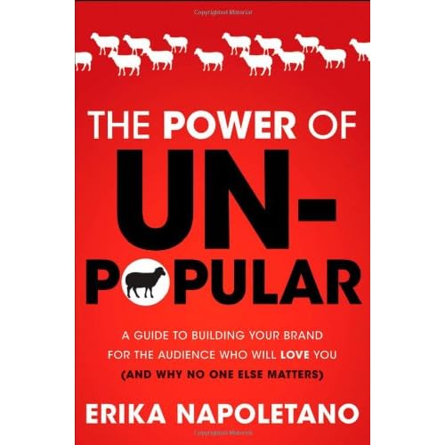
Book recs: Unpopular


Sometimes when I read a book, I don't really mention it to anyone. It may be a very good book. It may have changed the way I look at the world. But I don't mention it.

This is not one of those books.  (image links to amazon)


This book I mention to eeeeeeeeeveryooooooooooooone. Why? Because I know a lot of really independent people who are not really comfortable with the daily grind and the status quo but who are totally at home with lots and lots of hard work. 

Also we aren't always all that good at being introverts in an extroverts' world, and it's good to have a guide, now and again. If other people can do it, we can too!

But, no, seriously, you guys should really read this book.


Sunday, April 8, 2012

A bit of perspective

This is going to be another text post. Bear with me.

I've been going back and forth (and up and down and inside out) about how I feel about this MICA post bac thing. And to a lesser extent about being an alternate candidate at University of Washington, but I figure it's safer to assume rejected until proven otherwise with that one. But that's getting away from the point a bit.

This program is a good opportunity. It's a really good opportunity. MICA is a good school, and having them on my resume cannot hurt. They have access to many resources that I do not have that would make my life easier in both the long and short runs. A friend (Tracey Parker, go check her out) got accepted to the Hoffberger school of painting, so not only would I have someone familiar there, I would potentially have a pretty sweet roommate. They have studio space, which I need. The East coast is good. The East coast has a tradition of innovation.

Can you tell I've been trying to sell myself on this for a while now?

Because there are downsides. The biggest one is always going to be expense. $40,000 is a lot for a single year of education, none of which rolls over into a Master's program. There is no guarantee of being accepted into a Master's program after being a post-bac, even one of MICA's. I had thought that my next big move was going to be a long term move, but what if I only go there for one year? In fact, it will almost certainly be for only the one year (personal preference), and then I'll have to move again.

But the biggest, baddest tangle has been one that I didn't really expect.

In my natural state, I am viciously prideful, easily offended. These are not qualities that I appreciate in others, and I absolutely despise them in myself; I've spent a lot of time rooting out and getting rid of that sort of base reaction. Seriously, a lot of time. More than I really care to admit to. And I've done a pretty good job of it: I've never been personally offended by any critique, whether given by student or professor, and I consider rejection to be as natural an outcome as acceptance. But this....just....something....pinged.

When I got the first email inviting me to the post bac program, one of the things they said in the email was to feel free to contact this one guy on staff who had done the program himself. It was easiest for him to talk on the phone, so I called him, and this is where the seeds were really planted. He talked about how good an opportunity it was for him, about how it changed his life, about how the people he did the program with and people who have done it since have gone on to do great things. Ok, fine, I wasn't really expecting them to send me to someone who was going to spit on their program.

But he also said things like 'this is for people who show great promise, but just aren't there yet, and who we feel could benefit from just a little bit more time' and 'this program really demands a lot of hard work.'

And that, just.....yeah, no fucking duh it requires a lot of hard work. Some people apply directly to the post bac program, and so may not be aware of how bitchy the upper levels of higher education can be. I applied to their master's program. I was aware. I was ready. I already work at a pace and with a determination befitting a grad student. Before he said that, my mentality was just that the people who were chosen over me were better or more appropriate this year. Not that I was being perceived as lacking, let alone lazy.

So, yeah, I'm going to hesitate to give $40,000 to an institution if their first impression of me is that I'm a slacker. Because I'm not. That's the last bastion of my indefatigable pride: I may not always be the best, but I always work.

And heaped on top of all of that, I know that he didn't mean it that way. There are people who are legitimately not ready for the level of work that MICA demands. That any graduate program worth its salt demands. Warning people is only fair.

Except when it's not. So let's move away from this a little bit.

For people who are familiar with both my work and Terry Winters', it's pretty obvious that he's a big influence on my work. Not the only one, by any means, but a big one. He has a new show right now, 'Terry Winters: Cricket Music, Tessellation Figures, & Notebook' at the Matthew Marks gallery in New York. I haven't seen this show in person (ah, the midwest, so far from new york) but from what I'm seeing online, I quite like it.

There is a brief review of it on Two Coats of Paint, a blog for this sort of thing.

The review is...odd. I've seen others like it before, but I am always made uncomfortable by them. It starts off by citing other reviews, which are glowing, and then moves straight into exactly the opposite of that. Sharon Butler, the author of the review, spends time talking about the things that were good about Winters' old work specifically to illustrate how the new pieces don't measure up. It ends with a particularly condescending "Not many artists of Winters's caliber are willing to risk learning out loud, and for that alone, this show is worth seeing." 


This is a pretty nasty and fairly common 'damned if you do, damned if you don't' situation. On the one hand, if you become well known for painting in a certain way/working with a particular material/palette/subject/etc, and continue to do that, then you could be considered a sellout, lacking innovative edge. On the other hand, the moment you do depart from the familiar, you are no longer just compared (with an eye toward competition) with other artists, both contemporary and long deceased, but also with yourself.

Personally, I'm in the camp of innovation and risk being better than not, but I have no name, no following, no reputation to gamble, so it really costs me nothing to think that way.


Although I will say this: seeing this review and its sort of sly underhandedness made me feel a lot better about my own situation. It's not just me getting this sort of potentially demoralizing feedback, it's all of us.

Honestly, that needs to change, but for now, I will accept the solidarity.

Wednesday, April 4, 2012

Hunt Covers

As with the Air Squid covers, we're gonna start with the original design:


Outside of the Cover


And the inside. I wanted to experiment with pattern and having an interesting reveal when the book is opened. Screenprinting is still not my friend, btw, though I will continue to run my head into that brick wall until I get it right. 


And the new one! Just finished today!

I'm trying to be mindful of branding and consistency, so I have included my logo and all the text that isn't hand done is in Gill, which is one of three fonts that I use more than any others. 

If anyone is wondering about the price hike between the first version and the second: it's not just the updated, swanky cover. The first version was printed in black and white, but the files were done in color. This new version will be in color (my first! Very excited :) )


Tuesday, April 3, 2012

Air Squid Covers

HEY THAR I FINISHED ONE LET US COMPARE


Version 1, which premiered at last year's SPACE


Version 2, because we ran out of the first edition and also because I spelled the main character's name wrong on the cover of version 1. 

So, ok, things I kept from the first one: the price, the title (except correct this time), the main characters and some air squid, our names, the largely purple background. I also wanted to keep a wraparound element (because I like things like that) while keeping most of the interesting things on the front. I also added some text from inside the book because I always like to see that sort of thing.

Monday, April 2, 2012

Covers in progress

I started working on these almost as soon as I got home. There were driver updates, first, of course, because you can't leave home for more than a week without there being driver updates.

These aren't even close to done, but they should be soon. Look for them both at SPACE!


Had to pause because I got a for serious hand cramp, so I'm gonna go get tea and then keep working. Or maybe sleep and then work tomorrow? Coin toss.